User Interface Overview
Details about the Oxygen Content Fusion user interface and how it is organized for navigation and editing.
Oxygen Content Fusion provides an intuitive browser-based user interface designed for productivity and efficient collaboration.
Most screens follow this general layout pattern:
| Top Header Stripe | ||
|---|---|---|
Left Vertical Stripe
|
Current View | Main Working Area |
The following example illustrates the general UI pattern:
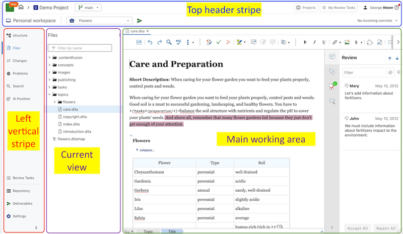
Top Header Stripe
The top header stripe contains shortcuts to the application's home screen, the list of projects and review tasks, access to the user profile, and the help menu. In addition, it shows information about the current resource you are working with, such as the project or the review task.
In the image above, the top-left area of the top header stripe shows the home button, the current project name, and the current branch. In the top-right area, it has shortcuts to the Projects and My Review Task lists, and the user and help menu buttons. The second line of the top stripe shows the current working area inside the project (in this case, Personal workspace) and other information related to the current task. A commit management drop-down menu also appears on the right side of the header stripe.
In addition to shortcuts and information based on the current page, the top stripe always includes the following options and components:
- Projects
- Opens the Projects page that displays a list of all the projects.
- My Review Tasks
-
Opens the My Review Tasks page that displays a list of all the current tasks that you own or that were assigned to you.
- User Name Menu
-
Your user name is displayed at the right side of the top stripe. If you click on your name, you have access to the following options:
- Profile
- Opens a profile settings page that displays your name, email, avatar, and allows you to delete your account or specify which types of notifications will be sent to you via email.
- Log Out
- Logs out of the Oxygen Content Fusion interface.
 Help Menu
- This menu contains the following actions:
- User Guide - Opens the online version of the user guide.
- Video Demonstrations - Opens a webpage with a variety of video demonstrations, webinars, and other presentations for Oxygen Content Fusion.
- What's New - Opens the What's New in Oxygen Content Fusion webpage, presenting the features and updates that were added in the latest version.
- Send Feedback - Opens a dialog box where you can send feedback about the application to the vendor.
- About - Opens a popup window that displays information about the current version of Oxygen Content Fusion.
Left Vertical Stripe
The top part of the left vertical stripe shows the list of available views. In the image above, Files is highlighted as the current view. The bottom part of the left stripe has shortcuts to other working areas of the project, including review tasks, the repository, defined deliverables, and project settings.
Current View
The view that is currently selected in the left vertical stripe is displayed after the left stripe. In the image above, the current view displays the content of the Files view.
Main Working Area
The main working area contains the visual editor along with its additional helper side views. In the image above, the topic highlighted in the Files view is open in the visual editor and the Review side view is open.