Layout of the Responsive Page Types
You can select from several different styles of layouts (for example, by default, you can select either a tiles or tree style of layout). Furthermore, each layout includes a collection of skins that you can choose from, or you can customize your own.
Main Page
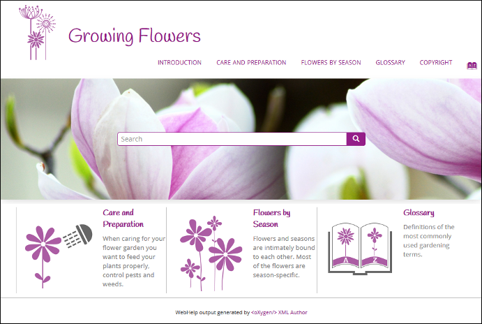
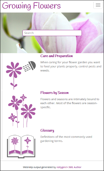
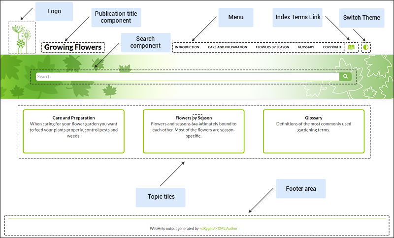
The Main Page is the home page generated in the WebHelp Responsive output. The main function of the home page is to display top-level information and provide links that help you easily navigate to any of the top-level topics of the publication. These links can be rendered in either a Tiles or Tree style of layout. The main page also consists of various other components, such as a logo, title, menu, search field, or index link.
Main Page - Tiles Layout
In the tiles presentation mode, a tile component is created for each chapter (first-level topic) in the publication. The tile presents a link to the topic and its short description.
Main Page - Tree Layout
In the tree presentation mode, links to the first and second level topics in the publication are displayed using a tree-like component.
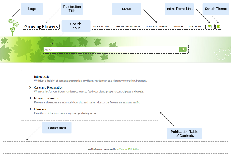
Main Page Components
The layout components displayed in the main page are:
- Publication Title
- The title of the publication. It is usually taken from the DITA map title.
- Logo
-
Displays a logo associated with the publication. Additionally, you can set a target URL that will be opened when you click on the logo image.
The logo image can be specified using the webhelp.logo.image transformation parameter. For the target URL, use the webhelp.logo.image.target.url parameter.
- Helps you to navigate to your documentation. This component presents a set of links to all topics from your publication. For information about customizing the menu, see How to Customize the Menu topic.
- Index Terms Link
- Presents a link to the index terms page. You can control if this component is displayed by using the webhelp.show.indexterms.link parameter.
- Switch Theme Button
- Presents a button that opens a drop-down menu for selecting the theme. You can control if this component is displayed by using the webhelp.enable.dark.mode parameter. For more information, see How to Create a Dark Mode-Ready Publishing Template.
- Search Input
- An input text field where you can enter search queries.
- Topic Tiles
-
A tile associated with a main topic. Each topic tile has three sections that correspond to the topic title, short description, and image.
- Topic Tile Title
- Presents the navigation title of the associated topic.
- Topic Tile Short Description
- Presents the short description of the topic. It may be collected either from the topic or from the DITA map topic meta.
- Topic Tile Image
- Presents an image associated with the topic. The image association is done in the DITA map.
- Tree Table of Contents
- An area that contains first and second-level topic titles from your publication.
- WebHelp Responsive output footer.
Topic Page
The Topic Page is the page generated for each DITA topic in the WebHelp Responsive output. The HTML pages produced for each topic consist of the topic content along with various other additional components, such as a title, menu, navigation breadcrumb, print icon, or side table of contents.
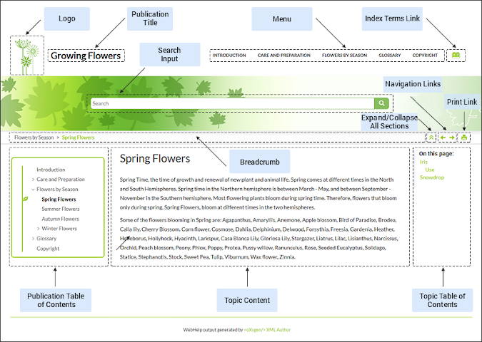
Topic Page Components
The layout components displayed in this page are:
- Publication Title
- The title of the publication. It is usually taken from the DITA map title.
- Logo
-
Displays a logo associated with the publication. Additionally, you can set a target URL that will be opened when you click on the logo image.
The logo image can be specified using the webhelp.logo.image transformation parameter. For the target URL, use the webhelp.logo.image.target.url parameter.
- Helps you to navigate to your documentation. This component presents a set of links to all topics from your publication. For information about customizing the menu, see How to Customize the Menu topic.
- Index Terms Link
- Presents a link to the index terms page. You can control if this component is displayed by using the webhelp.show.indexterms.link parameter.
- Switch Theme Button
- Presents a button that opens a drop-down menu for selecting the theme. You can control if this component is displayed by using the webhelp.enable.dark.mode parameter. For more information, see How to Create a Dark Mode-Ready Publishing Template.
- Search Input
- An input text field where you can enter search queries.
- The navigation links (
 Previous /
  Next arrows) can be used to navigate to the previous or next topic.
These navigation links are controlled by the
Next arrows) can be used to navigate to the previous or next topic.
These navigation links are controlled by the collection-typeattribute. For example, if you setcollection-type="sequence"on a parent topic reference, navigation links will be generated in the output for that topic and all of its child topics. You can also use thewebhelp.default.collection.type.sequenceparameter and set its value toyesto generate navigation links for all topics, regardless of whether or not thecollection-typeattribute is present.Tip:To hide the navigation links, you can edit the transformation scenario and set the value of thewebhelp.show.navigation.linksparameter tono. - Maximize to full width/Restore to normal width Button
- Icon that maximizes or restores the topic content to use the entire page space. Only visible when screen width exceeds 1600 pixels.
- Expand/Collapse Sections Button
- Icon that expands or collapses sections listed in the side table of contents within a topic.
- Print Link
- A print icon that opens the print dialog box for your particular browser.
- Button that opens a menu with "Copy as Markdown" and "View as Markdown" actions.
- Breadcrumb
- Presents the path of the current displayed DITA topic.
- Topic Content
- Presents the content of the associated DITA topic.
- Publication Table of Contents
- A Table of Content for the publication displayed in the left side of the screen.
You can use the
 button to collapse the
table of contents ( or the
button to collapse the
table of contents ( or the  button to
expand it).
button to
expand it). - Topic Table of Contents (On this page links)
- A table of contents for the topic displayed on the right side with a heading named
On this page and it contains links to each section within the current topic
and the section corresponding to the current scroll position is highlighted. This
component is generated for any topic that contains at least two
<section>elements and each<section>must have an@idattribute. You can use the button to collapse the table
of contents ( or the button to expand
it). - WebHelp Responsive output footer.
Search Results Page
The Search Page presents search results in the WebHelp Responsive output. The HTML page consists of a search results component along with various other additional components, such as a title, menu, or index link.
When you enter search terms in the
Search field, the results are displayed in a results page. When you
click on a result, the topic is opened in the main pane and the search results are
highlighted. If you want to remove the colored highlights, click the  Toggle Highlights button at the
top-right side of the page. The Search field also includes an
autocomplete feature.
Toggle Highlights button at the
top-right side of the page. The Search field also includes an
autocomplete feature.
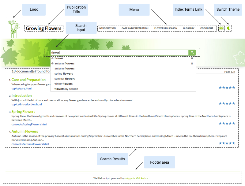
Search Results Page Components
The layout components displayed in the search page are:
- Publication Title
- The title of the publication. It is usually taken from the DITA map title.
- Logo
-
Displays a logo associated with the publication. Additionally, you can set a target URL that will be opened when you click on the logo image.
The logo image can be specified using the webhelp.logo.image transformation parameter. For the target URL, use the webhelp.logo.image.target.url parameter.
- Helps you to navigate to your documentation. This component presents a set of links to all topics from your publication. For information about customizing the menu, see How to Customize the Menu topic.
- Index Terms Link
- Presents a link to the index terms page. You can control if this component is displayed by using the webhelp.show.indexterms.link parameter.
- Switch Theme Button
- Presents a button that opens a drop-down menu for selecting the theme. You can control if this component is displayed by using the webhelp.enable.dark.mode parameter. For more information, see How to Create a Dark Mode-Ready Publishing Template.
- Search Input
- An input text field where you can enter search queries.
- Search Results
-
Each result includes the topic title that can be clicked to open that page. Under the title, a breadcrumb is displayed that shows the path of the topic and you can click any of the topics in the breadcrumb to open that particular page.
- WebHelp Responsive output footer.
Auto-complete Suggestions in the Search Input Field
- The search queries from the history of the previous searches.
- The titles collected from your documentation.
- Documentation index terms and keywords. For example, in a DITA
topic, the keywords and index terms are specified in the topic prolog section like
this:
<prolog>
  <metadata>
    <keywords><indexterm>databases</indexterm></keywords>
    <keyword>installing</keyword>
    <keyword>uninstalling</keyword>
    <keyword>prerequisites</keyword>
  </metadata>
</prolog>
Missing Terms
If you enter multiple search terms (other than stop words), for any result that the search engine found at least one term but not one or more of the other terms, the Missing terms will be listed below each result.
Index Terms Page
The Index Terms Page page consists of an index terms section along with various other additional components, such as a title, menu, or search field.
An alphabet that contains the first letter of the documentation index terms is generated at the top of the index page. Each letter represents a link to a specific indices section. The indexes are presented in multiple columns to make it easier to read this page.
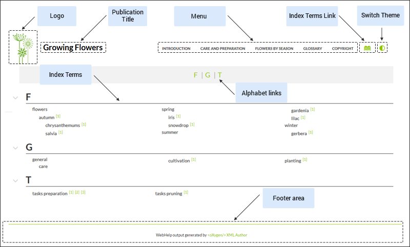
Index Terms Page Components
The layout components displayed in this page are:
- Publication Title
- The title of the publication. It is usually taken from the DITA map title.
- Logo
-
Displays a logo associated with the publication. Additionally, you can set a target URL that will be opened when you click on the logo image.
The logo image can be specified using the webhelp.logo.image transformation parameter. For the target URL, use the webhelp.logo.image.target.url parameter.
- Helps you to navigate to your documentation. This component presents a set of links to all topics from your publication. For information about customizing the menu, see How to Customize the Menu topic.
- Index Terms Link
- Presents a link to the index terms page. You can control if this component is displayed by using the webhelp.show.indexterms.link parameter.
- Switch Theme Button
- Presents a button that opens a drop-down menu for selecting the theme. You can control if this component is displayed by using the webhelp.enable.dark.mode parameter. For more information, see How to Create a Dark Mode-Ready Publishing Template.
- Index Terms Alphabet
- An alphabet that contains the first letter of index terms. Each letter represents a link to a specific indices section.
- Index Terms
- The first letter of the index along with the list of index terms.
- WebHelp Responsive output footer.