DITA Reusable Components View
The DITA Reusable Components view is helpful if you use a large number of keys or reusable components in your DITA project. It collects all of the keys and reusable components that are defined in the root map and presents them in a side view where you can easily locate and insert references to them. It recollects the keys anytime the root map is changed or you switch the editor focus to a different file.
- Keys - Displays all the keys that are defined in the root map and provides ways to easily
insert references to them as cross reference links, key references, or variables. It
includes a search field, some filtering and sorting options to help you find particular
keys, and some contextual menu actions. It also supports drag and drop actions and
double-clicking a key is the fastest way to insert a reference.Note:If the keys are gathered from peer DITA maps (used in cross publication references), the keys that define variables are not presented.
- Components - Displays all the reusable components found
in the root map and provides ways to
easily insert them as content references or content key references. To determine which
components to display in this tab, Oxygen XML Editor looks for any topicref in
the root map that is marked as
resource-only and then looks for elements with an assigned
@idattribute value. This tab includes a search field, some filtering options, and some simple links and contextual menu actions to quickly insert references or open their source file. It also supports drag and drop and double-clicking actions. - Media - Displays all images referenced as keys in the root map along with all images found in the user-defined working sets.
Keys Tab
The DITA Reusable Components view collects all the keys that are defined in the current root map and displays them in the Keys tab. This tab has two view modes. The default tiles style view mode and a table style view mode.
Tiles Mode
The default tiles mode displays the keys as blocks (cards). The
advantage of this display mode is that more information about each particular key can be
seen even when the view is sized with a small width. Each block (card) displays the name of
the key (the value of the @keys attribute), followed by its description
and/or @href value, then followed by the name of the DITA map file where the
key is defined.
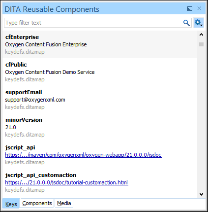
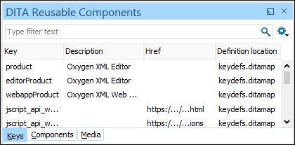
Table Mode
You can switch to a table style display mode by selecting the
Table mode toggle action from the  Settings menu. The advantage of this display mode
is that more keys can be listed at once. In this mode, keys that are defined with a text
value in the
Settings menu. The advantage of this display mode
is that more keys can be listed at once. In this mode, keys that are defined with a text
value in the <navtitle> or <keyword> element
have that value listed in the Description column, while keys that are
defined with a value in an @href attribute have that href value listed in
the Href column.
Both display modes in the Keys tab include a variety of features and options:
- Search Filter
- You can enter text in the filter field at the top of this tab to filter the list and search for specific keys.
- Sorting
-
Tiles Mode: In the default tiles display mode, to sort the keys alphabetically in ascending order, select Sort by key name from the
Settings menu.Table Mode: In the table display mode, the following columns can be sorted by clicking the heading:- Key - The name of the key (the value of the
@keysattribute). - Description - The description of the key that
is obtained from its definition. Keys that are defined with a text
value in the
<navtitle>or<keyword>element have that value listed in this column. - Href - Keys that are defined with a value in
an
@hrefattribute have that href value listed in this column. - Definition Location - The name of the DITA map where the key is defined.
- Key - The name of the key (the value of the
- Double-Click Mechanism
- You can double-click any key listed in this tab to insert a key reference at the
current cursor position or surrounding the current selection.
- If the selected key points to an
@hrefvalue, it is inserted as a cross reference link (xref). - If the selected key is a reference to an image, it is inserted
as an
<image>element. - If the selected key does not have an associated
@href, it is inserted as a variable reference (ph).
- If the selected key points to an
- Drag and Drop Mechanism
- You can drag a key from this tab and drop it in the main editor to insert a key
reference at the current cursor position.
- If the selected key points to an
@hrefvalue, it is inserted as a cross reference link (xref). - If the selected key is a reference to an image, it is inserted
as an
<image>element. - If the selected key does not have an associated
@href, it is inserted as a variable reference (ph).
- If the selected key points to an
- Contextual Menu Actions
-
- Insert as Link
- Inserts a cross reference link (xref) to the selected key at the current cursor position or surrounding the current selection.
- Insert as Variable
- Inserts a variable reference (ph) to the
selected key at the current cursor position or surrounding the current selection.
However, if the selected key is a reference to an image, this action inserts the key
reference in an
<image>element. - Insert as Keyref
- Presents a submenu with all the elements that can be inserted at the current cursor
position. Selecting an element will insert that element at the current cursor position
or surrounding the current selection with a
@keyrefattribute and its value set to the selected key. - Insert as Figure
- Available if the selection is an image, it inserts the image inside a figure element
(
<fig>). Note that the<title>element of the inserted figure will be empty. - Rename Key
- Opens a refactoring
wizard where you can easily rename the key and define the scope of the
operation. It also updates all references to it.Notes:
- This action does not work on DITA 1.3 key scopes.
- This action is only available if the DITA map opened in the DITA Maps Manager is also selected as the Root map.
- Go to Definition
- Opens the DITA map where the key is defined.
- Search References
- Searches for all references to the selected key in the entire DITA map structure.
- Group by Definition Location (Available in Table mode only)
- A toggle action that can be used to group (and sort) all the keys based on the value in the Definition Location column.
- Settings Menu
-
This menu includes the following options:
- Filtering Options
-
- Show all - Shows all defined keys found in the current root map.
- Show only variables - Filters the keys to show only those defined as variable references.
- Show only maps and topics - Filters the keys to show only those that reference DITA maps or topics.
- Show only multimedia resources - Filters the keys to show only those that reference multimedia resources (such as images).
- Show only external resources - Filters the keys to show only those that reference external resources (such as web links).
- Show only keys with closest relative key scope - Filters the presented keys to hide the fully qualified key scope paths and show only the relative key references that have the closest relative key scope path in the current context. This toggle option can be combined with any of the other filtering options. It is deselected by default. This option always remains synchronized with this same option in the Media tab so changing it one of the tabs also changes it for the other.
- Sort by key name (Available in Tiles mode only)
- Sorts the keys alphabetically in ascending order.
- Table mode
- A toggle action that switches between the table and tiles display modes.
Components Tab
<topicref> in the DITA map file must have
a @processing-role attribute set like
this:<topicref href="topics/randomize-xml-content.dita" processing-role="resource-only"/>processing-role="resource-only" to be candidates to contain
reusable components. The reusable components inside these topics are collected from all
elements that have an ID specified. These reusable components are displayed in the
Components tab along with the file name and the specific names of
the elements that contain an ID attribute. 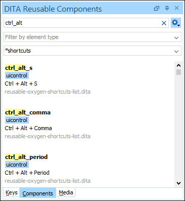
The Components tab includes the following features and options:
- Search Filter
- You can enter text in the filter field at the top of this tab to filter the list and
search for specific content inside the list of reusable components. This field
supports many of the Lucene-based search patterns, such as wildcards
(
*or?), boolean operators (AND,OR,NOT), fuzzy searches (~), boosting searches (^), and more. - Settings Menu
-
This menu includes the following options:
- Compact Mode
- You can use this toggle action to switch the display for the Components tab to a compact visualization mode. When switched to Compact mode, fewer details are shown for each component, but more components are displayed in the view.
- Reindex
- You can use this action force a re-indexing of the reusable components.
- Show Elements of Type
- You can use this drop-down list to select specific types of elements to be displayed in the list of components. This can help you narrow down the list of possible source elements that you can select.
- Source File(s)
- You can use this combo box to search for specific source files (the topics that
contain reusable components) or select a file from its drop-down list. You can also
use wildcards (such as
*or?) in this field. - Double-Click Mechanism
- You can double-click any reusable component listed in preview window in this tab to
insert it as a content reference or content key reference at the current cursor
position or replace the current selection.
- If the parent topic of the selected component has a key defined, it is inserted as a content key reference (conkeyref).
- If the parent topic of the selected component does not have a key defined, it is inserted as a content reference (conref).
- Drag and Drop Mechanism
- You can drag a reusable component from the preview window in this tab and drop it in
the main editor to insert a content reference or content key reference at the current
cursor position.
- If the parent topic of the selected component has a key defined, it is inserted as a content key reference (conkeyref).
- If the parent topic of the selected component does not have a key defined, it is inserted as a content reference (conref).
- Hover and Click Actions
-
If you hover over a component shown in the preview window, you have access to the following link actions:
- Insert
- Inserts the component as a content reference or content key reference at the current cursor position or replaces the current selection. If the parent topic has a key defined, it is inserted as a content key reference (conkeyref). Otherwise, it is inserted as a content reference (conref).
- Open
- Opens the source file that contains the reusable component.
- Contextual Menu Actions
-
- Insert Content Reference
- Inserts the component as a content reference (conref) at the current cursor position or replaces the current selection.
- Insert Content Key Reference
- Inserts the component as a content key reference (conkeyref) at the current cursor position or replaces the current selection. This action is only available if the parent topic has a key defined.
- Go to Definition
- Opens the source file that contains the reusable component.
- Search References
- Searches for all references to the selected component in the entire DITA map structure.
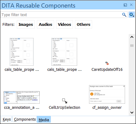
Media Tab
The Media tab displays all media resources (images, audio, video) referenced as keys in the current root map along with all audio, image, and video resources found in user-defined working sets.
The Media tab includes the following features and options:
- Search Filter
- You can enter text in the filter field at the top of this tab to filter the list and search for specific media resource key or file names in the list of available resources.
- Resource Type Filter
- You can quickly show resources of a specific type by clicking one of the type buttons (Images, Audio, Video, Others).
- Settings Menu
-
This menu includes the following options:
- Sort by date
- Sorts the presented resources based on both the date when they were last modified and the date they were created.
- Show only keys with closest relative key scope
- Filters the presented keys to hide the fully qualified key scope paths and show only the relative key references that have the closest relative key scope path in the current context. This toggle option can be combined with any of the other filtering options. It is deselected by default. This option always remains synchronized with this same option in the Keys tab so changing it one of the tabs also changes it for the other.
- Configure working sets
- Use this option to define folders where the media resources will be gathered. The Media tab will include audio, image, and video resources collected from the current root map as well as media resources located in the folders defined as active working sets. The working sets are defined at project level so that they can be easily shared with others. To save working sets in the global user-specific settings instead, in the page you can uncheck the Save DITA media working sets at project level checkbox.
- Reload
- Refreshes the list of displayed media resources. This is useful if resources were recently added in the searched folders.
- Double-Click Mechanism
- You can double-click any media resource in the list to add a reference to it.
- Drag and Drop Mechanism
- You can drag a media resource from the list and drop it in the main editor to add a reference to it.
- Contextual Menu Actions
-
- Insert As Image Reference
- Inserts an image reference. If the resource is referenced using a key in the DITA map, an indirect reference using the defined key will be used. Otherwise, the reference will point directly to the resource location.
- Insert As Audio Reference
- Inserts an audio reference. If the resource is referenced using a key in the DITA map, an indirect reference using the defined key will be used. Otherwise, the reference will point directly to the resource location.
- Insert As Video Reference
- Inserts a video reference. If the resource is referenced using a key in the DITA map, an indirect reference using the defined key will be used. Otherwise, the reference will point directly to the resource location.
- Insert As Embedded Reference
- Inserts as an embedded reference. If the resource is referenced using a key in the DITA map, an indirect reference using the defined key will be used. Otherwise, the reference will point directly to the resource location.
- Insert as Link
- Inserts a link to the resource, either as a DITA
<xref>or<link>, depending on the cursor position. - Insert as Variable
- Inserts a variable reference (ph) to the
selected key at the current cursor position or surrounding the current selection.
However, if the selected key is a reference to an image, this action inserts the key
reference in an
<image>element. - Insert as Keyref
- Presents a submenu with all the elements that can be inserted at the current cursor
position. Selecting an element will insert that element at the current cursor position
or surrounding the current selection with a
@keyrefattribute and its value set to the selected key. - Insert as Figure
- Available if the selection is an image, it inserts the image inside a figure element
(
<fig>). Note that the<title>element of the inserted figure will be empty. - Preview
- Shows the selection in an Image Preview side view.
- Open in System Application
- Opens the default system editor/viewer associated with the resource type.
- Show in Explorer/Finder
- Opens the default file browser at the specific folder where the resource is located.
- Key definitions are always presented first, in document order.
- Resources defined and collected from working sets are sorted alphabetically by name, for each folder separately.